Certinia: a rebrand, made usable.
Eight years, apprentice to Creative Manager, ending with the refresh that refit a lifestyle-brand identity for a B2B software company.
The starting point
I was part of the original FinancialForce to Certinia rebrand, creating the video content and carrying it through the transition. But the identity it produced was built like a lifestyle brand: heavy gradients, ten bright secondary colours, an ornate custom serif. And it was never finished. The brand team was laid off with the guidelines still in first draft, overly broad and open to interpretation, so everyone read them differently. Outside agencies most of all: each deliverable came back looking like a different brand.
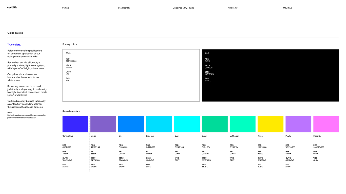
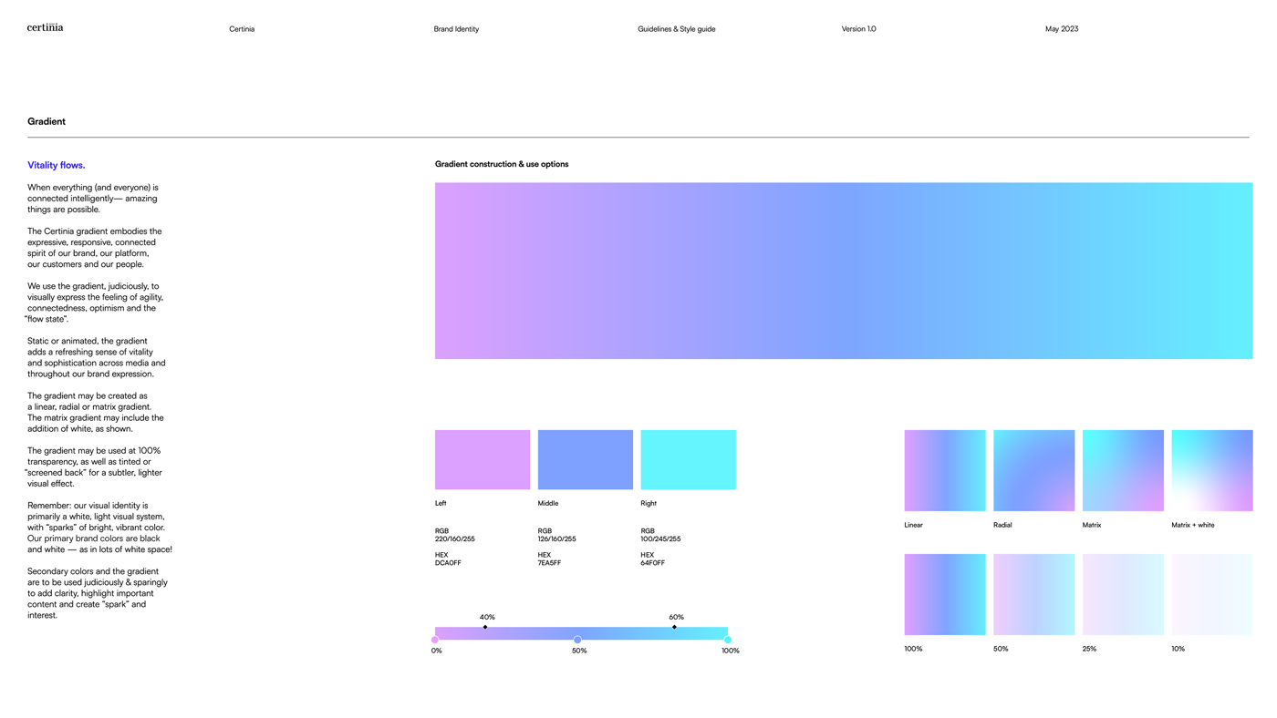
fig. — the inherited system, in its own pages: ten bright secondary colours, and the expressive gradient that went on everything.
The decks made the problem visible to everyone. We were selling enterprise software to professional‑services companies on slides stacked with colourful gradients, closer to a bag of Skittles than a software company, spread across roughly a hundred layouts nobody could choose between. Executives said there was too much choice. Teams agreed by not using it.
When the team was cut to two, I took over running brand and creative, and new leadership asked for a refresh rather than another rebrand: keep the equity, fix the usability. The executives each had their own version of the complaint: the CEO wanted high contrast, the CRO wanted the bright gradients and colours toned right down, the CMO wanted gradients gone entirely. The COO’s brief put it plainest: run the enterprise playbook. Standard branding, easy for everyone to understand, nothing that alienates the audience we sold to.
The refresh itself started outside: an agency had sold the full package, branding included. What came back, round after round, was nearly the same work faintly rearranged, run through AI for completeness but with no strategy underneath, no reason you could trace a choice back to. So I didn’t wait for a handover. I took the brand work over: the palette, the typography, the guidance, and the design behind them.
What I built
The reposition drove everything: less lifestyle brand, more the professional‑services company we actually sold to. But positioning doesn’t live in a strategy document; it lands as aesthetic calls, made one at a time for a reason. The first was the one the executives kept circling without quite articulating: the problem was never gradients themselves, it was harsh ones, colour stops spaced so far apart that the transitions turned drastic. Gradients earn their place in a design, adding depth and texture, so instead of banning them the new guidelines set a hard limit on how far apart stops could sit. An executive complaint, turned into a rule anyone could apply.
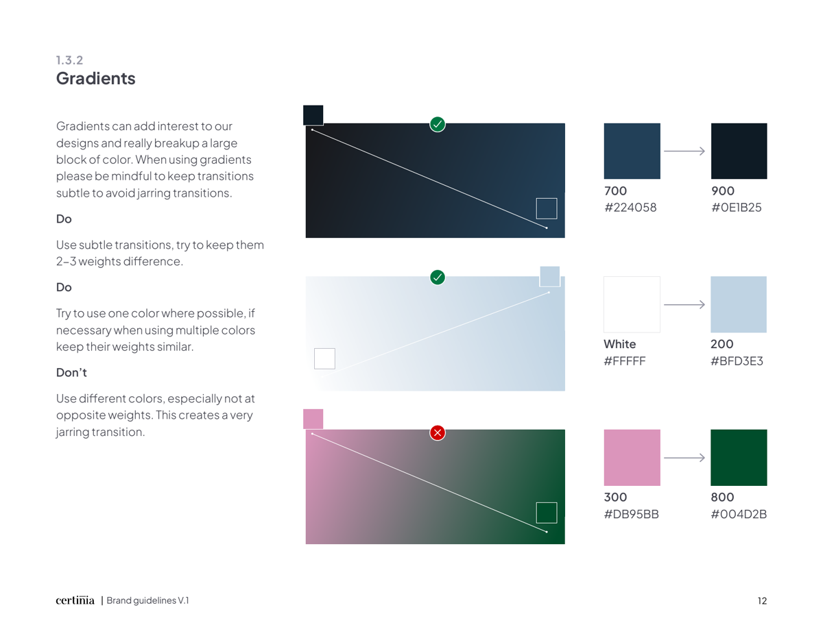
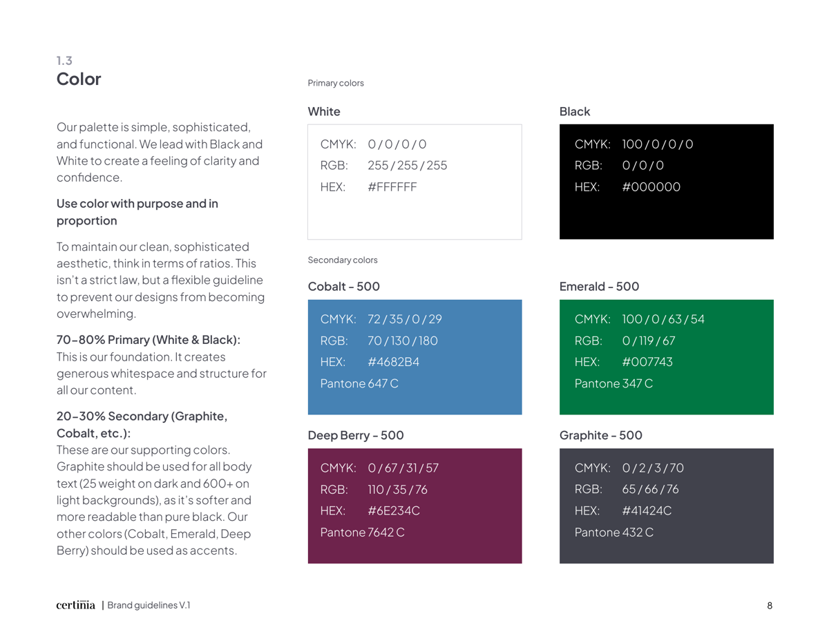
fig. — the same territory after the refresh: gradient stops capped at two to three weights, with the do/don’t to prove it; and colour used with purpose, in proportion.
The deck system carried that thinking first. Harsh gradients gave way to clean, workable slides, and a hundred‑odd layouts were cut to a core set people could actually build with, so picking the right slide stopped being a job in itself.
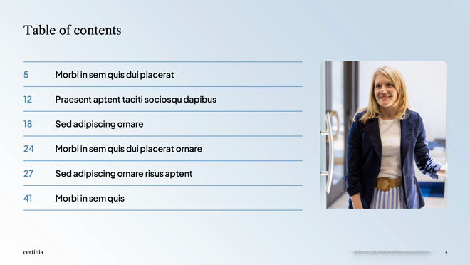
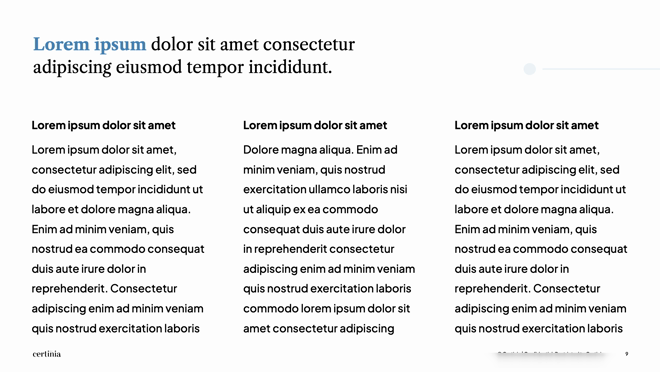
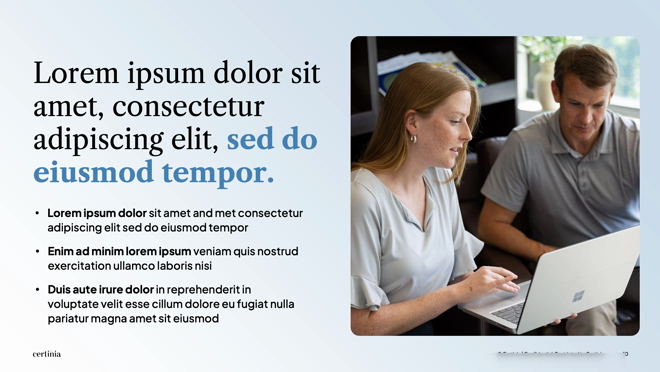
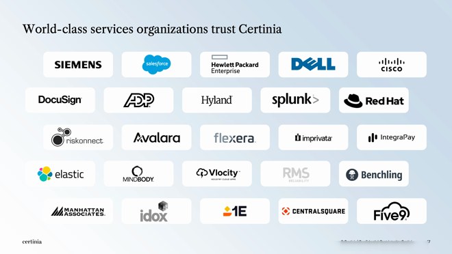
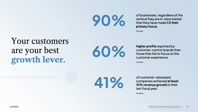
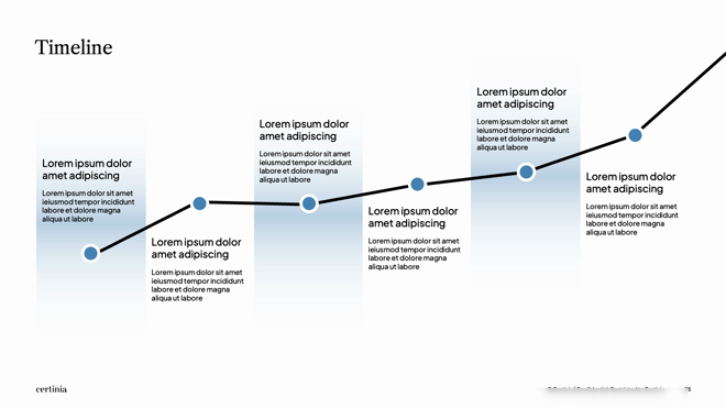
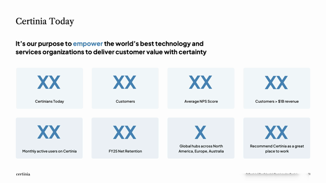
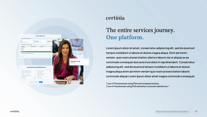
fig. — eight layouts from the refreshed template, as shipped to the company: clean, high‑contrast, projector‑safe, and a core set anyone can build with.
The guidelines were rebuilt to be used rather than interpreted, and split by who needs them: one overall brand guide carrying what everyone working with Certinia should know, then tailored guidance per function, so a design agency gets design, a video contractor gets media, a copywriter gets copy. The palette was tightened the same way, and chosen with intent: our competitors had converged on the same look, and the original rebrand had dropped us squarely in the middle of them. Every colour had a reason behind it: standing apart from that crowd, reading trusted and tenured rather than trend‑led, and sitting comfortably next to Salesforce, whose ecosystem we sold in and ran joint campaigns with. Typography moved from an ornate custom Bodoni, whose thin serifs fell apart at small sizes, to web‑safe Google Fonts that stay readable at every scale. Stock imagery gave way to custom, people‑focused photography, and we re‑platformed the website off legacy WordPress onto a proper CMS.
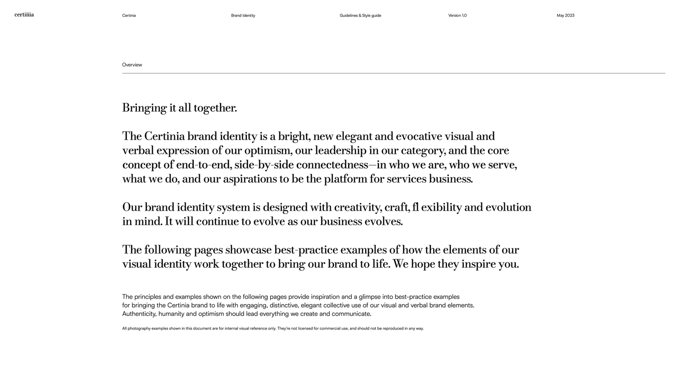
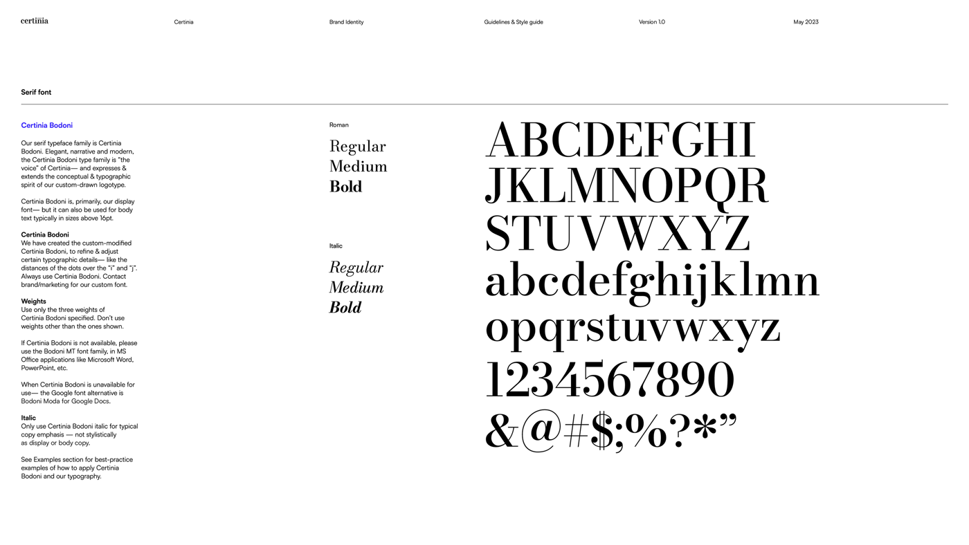
fig. — the old guide, in its own words: a closing third of best‑practice examples that ended with “we hope they inspire you”, set in the ornate serif the identity leaned on.
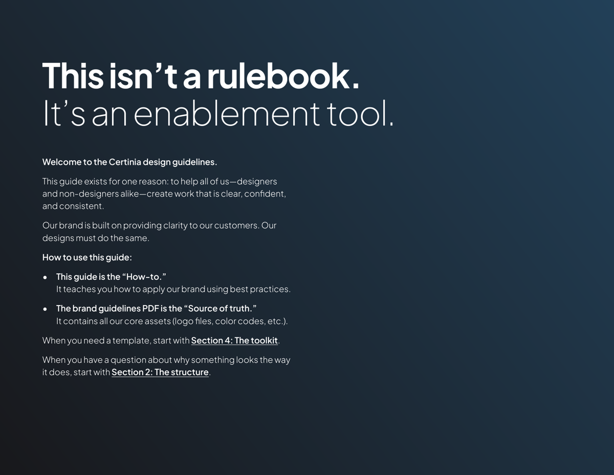
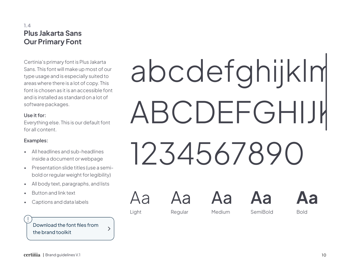
fig. — the refresh’s answer: an enablement tool, not a rulebook. And a face chosen for accessibility and availability, not ornament.
Through it I ran the creative function end to end: creative direction, resourcing and project management, and brand enablement and compliance.
What changed
A brand people could actually use, consistently, on every platform. And a lesson that became a method: I’d watched an identity optimised for how it looks fail at how it works. Everything I’ve built since treats brand as a system first. That method, plus the AI to scale it, is what I did next at Dremio.